Understanding The 7 Colour Harmonies
Colour harmonies are a fundamental principle that plays a crucial role in various forms of art, interior design is no exception. They involve understanding which colours work well together to create visually pleasing contrasts and consonances. Achieving colour harmonies in interior design balances colours for a better look, and cohesive brand identity, significantly impacting the overall aesthetics.
A Quick Lesson on Colours
It’s important to understand the basics of colour. Primary colours – red, yellow, and blue – are the building blocks of all other colours and cannot be created by mixing other colours. Secondary colours, such as orange, purple, and green, are formed by mixing primary colours. Tertiary colours lie between primary and secondary colours, such as yellow-orange, red-purple, blue-green, etc.
Key Terms in Colour Theory
Colour is a general term used to describe every hue, tint, tone, or shade, including white, black, and grey. Hue refers to the dominant colour family of a specific colour, excluding white, black, and grey. Tone is a pure colour with grey added, which tones down its intensity. If too much grey is added, the colour can become dull. Tint, also called pastel, is created by adding white to a pure colour, making it lighter. Shade involves adding black to a colour, making it darker without the addition of grey or white.
Colour Harmonies & Their Impact on Interior Design
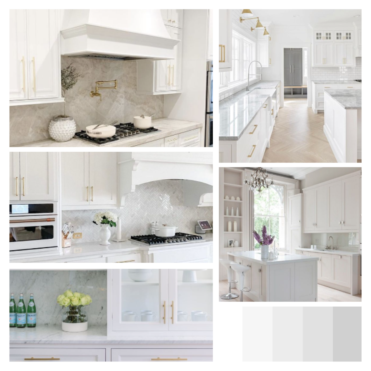
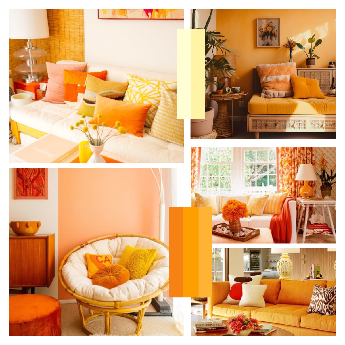
Different colour harmonies can create various effects in interior design. An achromatic scheme, which includes colours lacking hue such as grey, black, and white, often gives a modern vibe to interiors. Analogous colours, which are groups of colours next to each other on the colour wheel (for example red, red-orange, and orange), provide a warm or cool range and often give interiors a rich vibe.
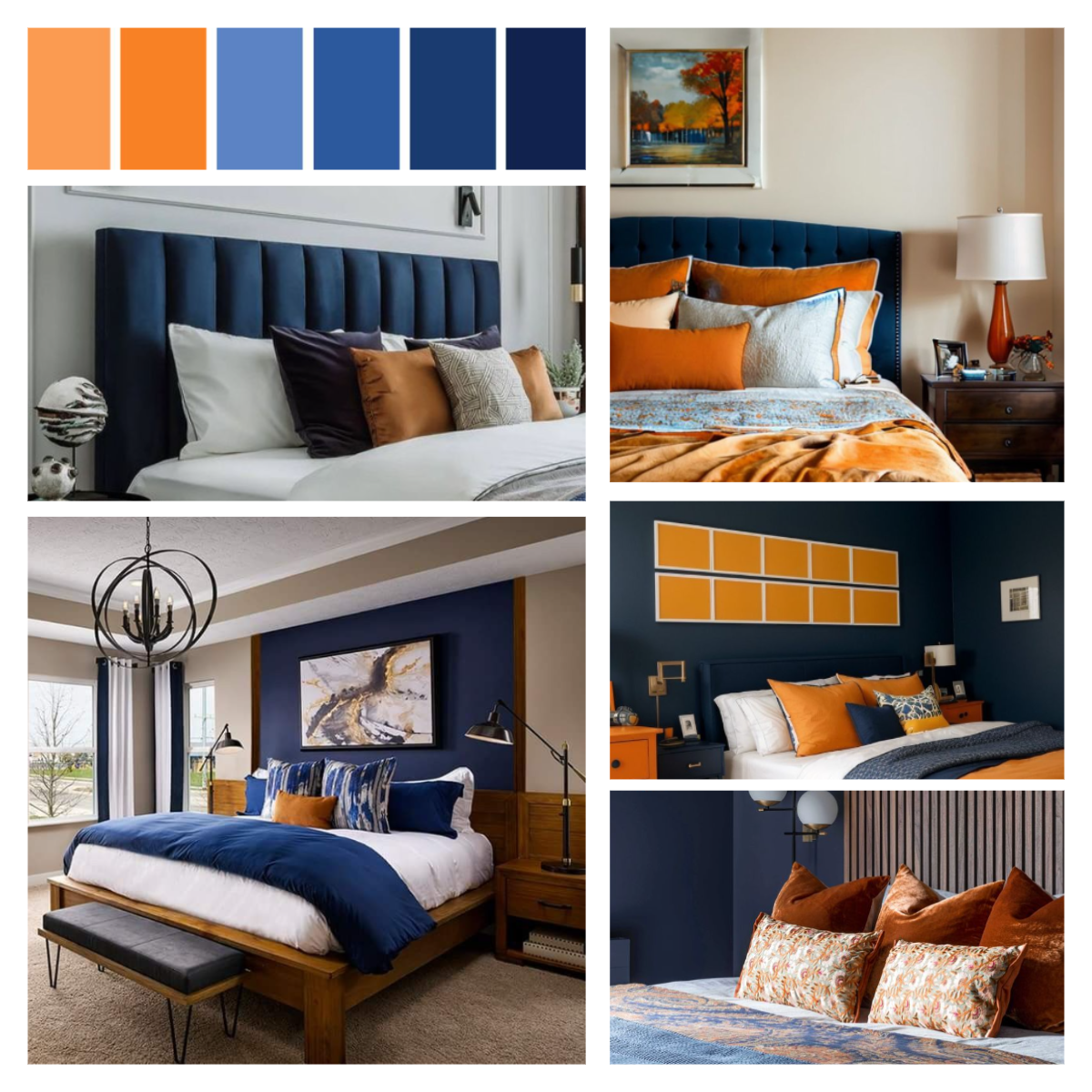
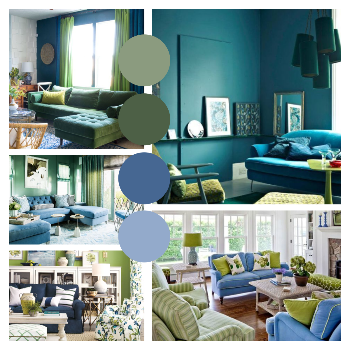
Complementary colours, like orange and blue, are opposite to each other on the colour wheel. This scheme is used to draw the eye and often gives interiors a bold look. Split complementary schemes involve two colours on the opposite side of the wheel and one on the other side, forming a triangle. For instance, orange, blue, and purple create a bold look with a balancing middle colour.
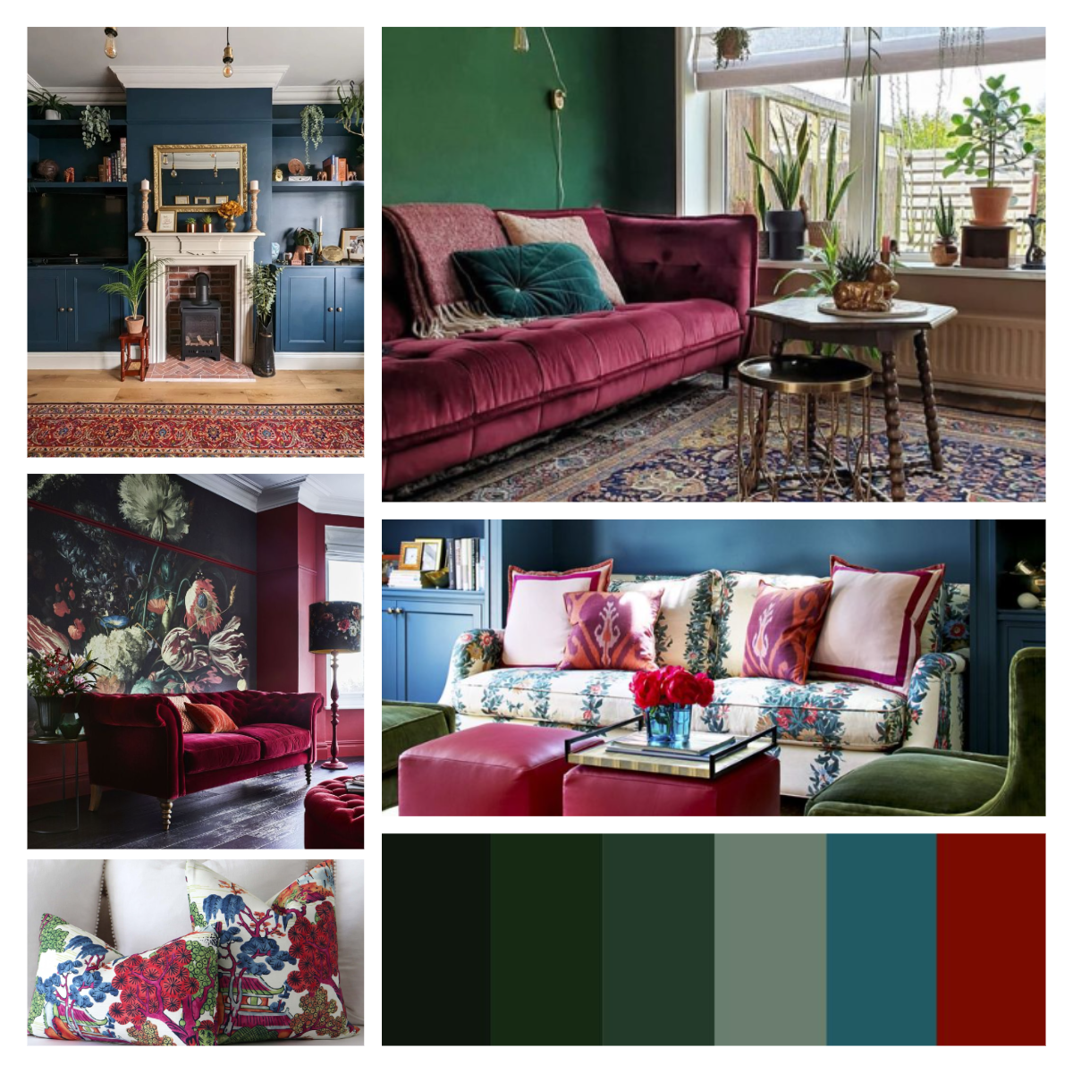
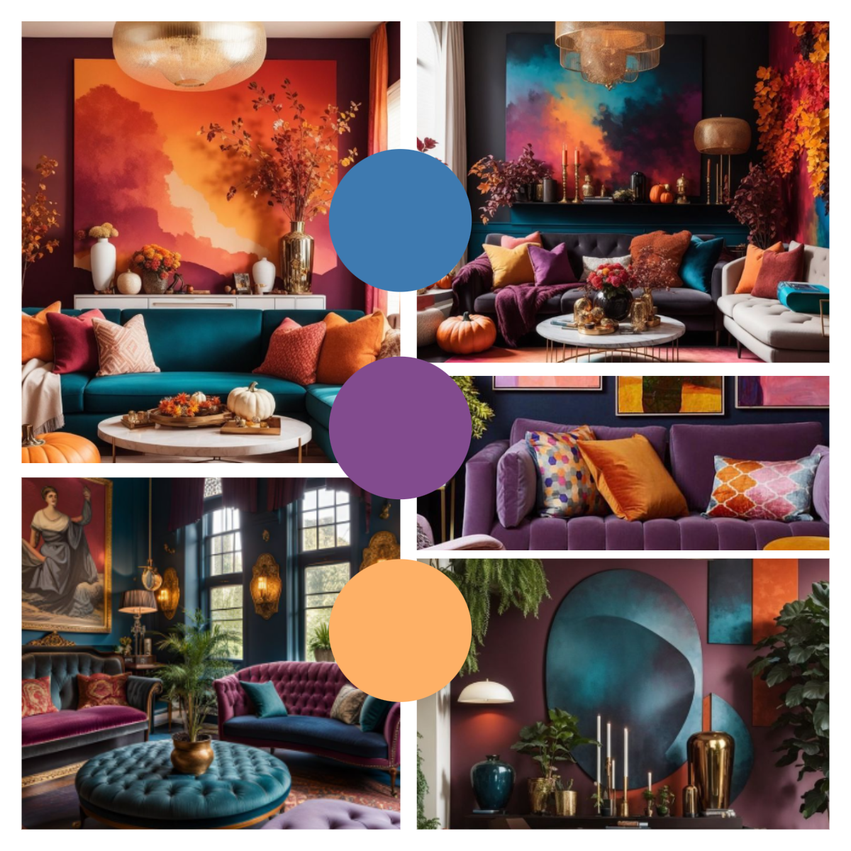
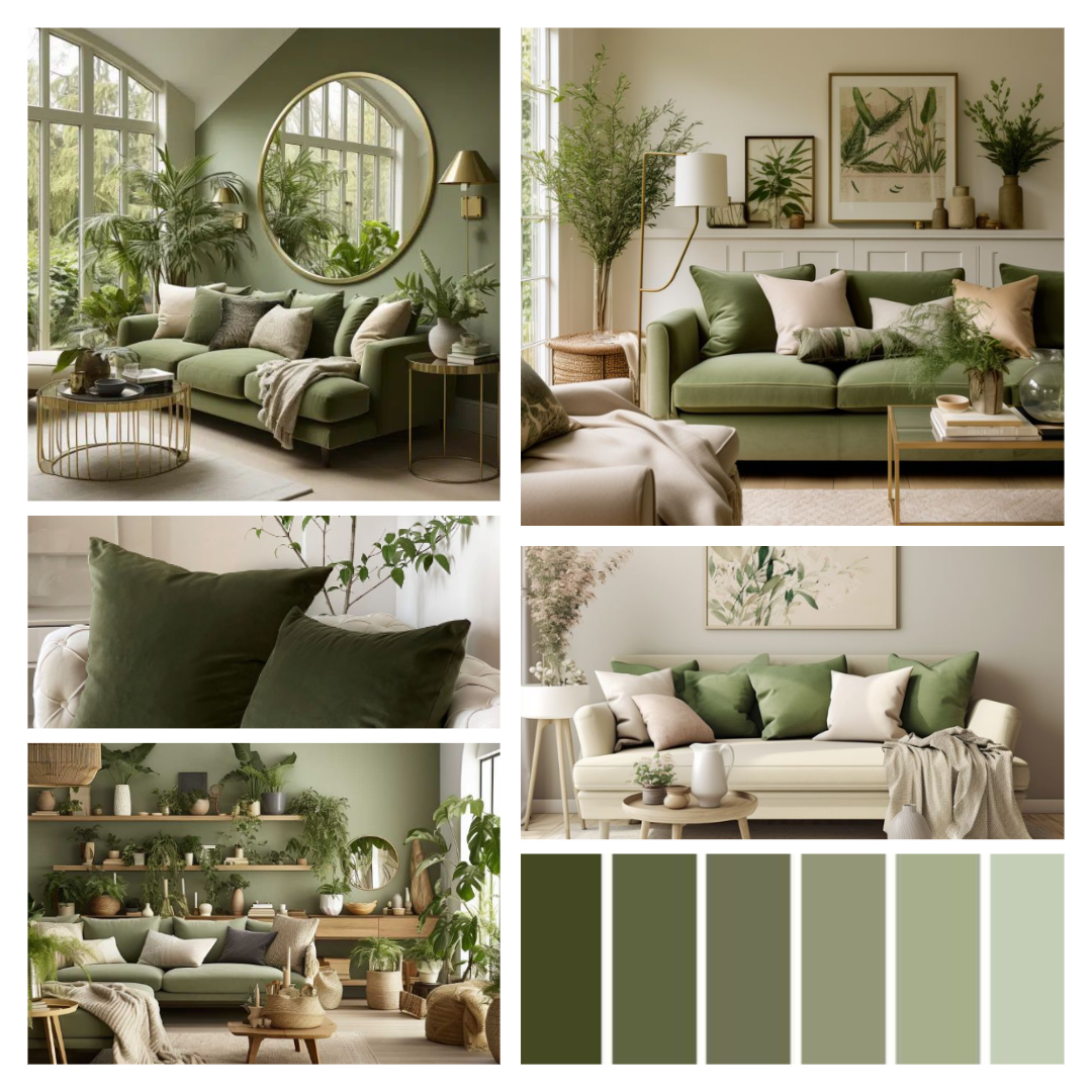
Monochromatic schemes consist of variations of a single colour, such as adding white to red to create pink or black to red to make maroon. This range from light to dark gives spaces a bold, rich vibe. Multi-hue schemes use multiple pigments of the same colour together, providing a sense of cohesion in a space. Finally, triadic schemes feature a dominant hue with two evenly spaced accent colours, forming a triangle on the colour wheel, like orange, purple, and blue. This scheme gives rooms a lively, calm pop of brightness.
Applying Colour Harmonies in Interior Design
When designing interiors, understanding and applying colour harmonies can transform a space. For instance, an achromatic scheme can create a sleek, modern look in a living room, while an analogous colour harmony might bring a warm, cozy feeling to a bedroom. Complementary colours are perfect for accent walls or statement pieces that draw attention, while the split complementary colour harmony offers a balanced yet dynamic aesthetic.
Monochromatic schemes are ideal for creating a sophisticated and unified look, particularly in minimalist designs. Multi-hue schemes can be used to introduce subtle variations that add depth and interest without overwhelming the space. Triadic colour schemes, with their vibrant and balanced hues, are excellent for creating lively and engaging environments in areas like children’s rooms or creative spaces.
Understanding and applying colour harmonies in interior design is essential for creating visually appealing and effective spaces. By using the principles of primary, secondary, and tertiary colours, along with various colour harmonies, you can achieve a balanced and harmonious aesthetic in any room.
Incorporating colour harmonies into your design process not only enhances the visual appeal but also ensures a cohesive and well-balanced final product. Whether you’re redecorating a room, choosing a colour palette for a new home, or designing a commercial space, mastering the art of colour harmonies will elevate your work to new levels of professionalism and beauty.